


New York, NY
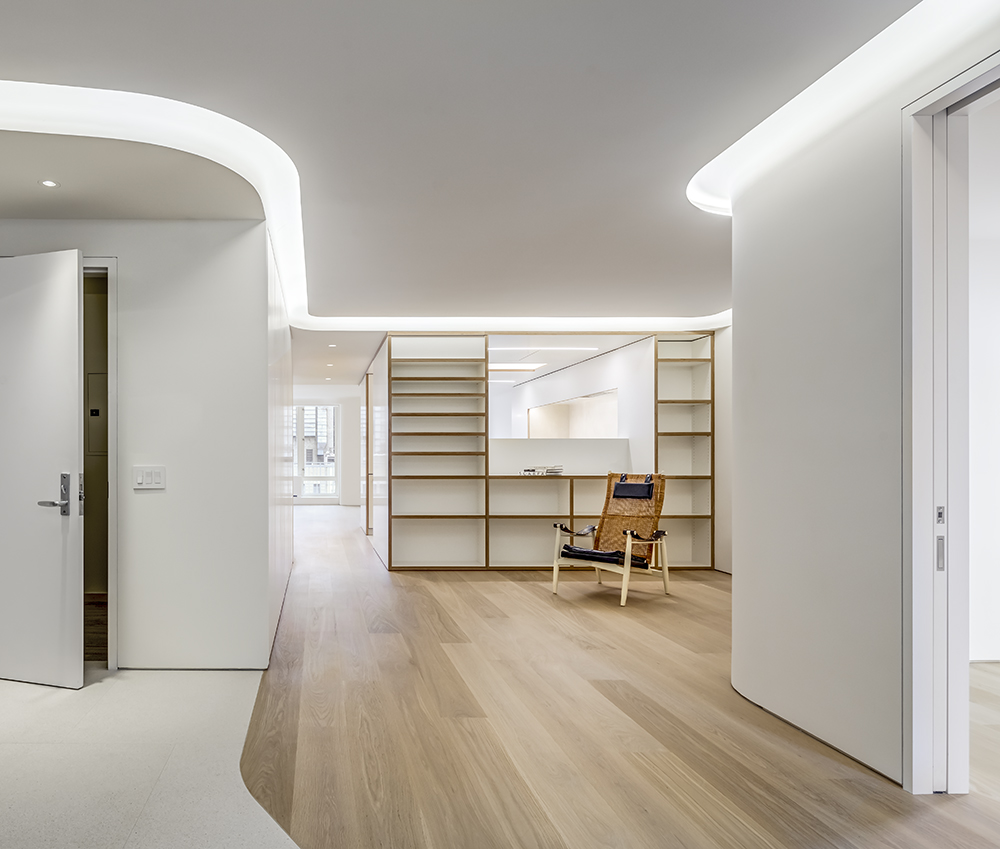
The project is a gut renovation and expansion of a penthouse apartment in the East Village neighborhood of Manhattan. The owners, a young family with 3 children, needed to add bedrooms but more importantly, wanted to create open and inviting shared spaces for all members. Although the combination of two apartments would have created a substantially larger home, the team decided to create a small rental unit and use the remainder for the new design. More
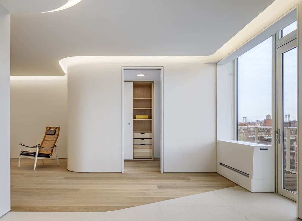
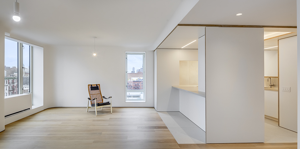
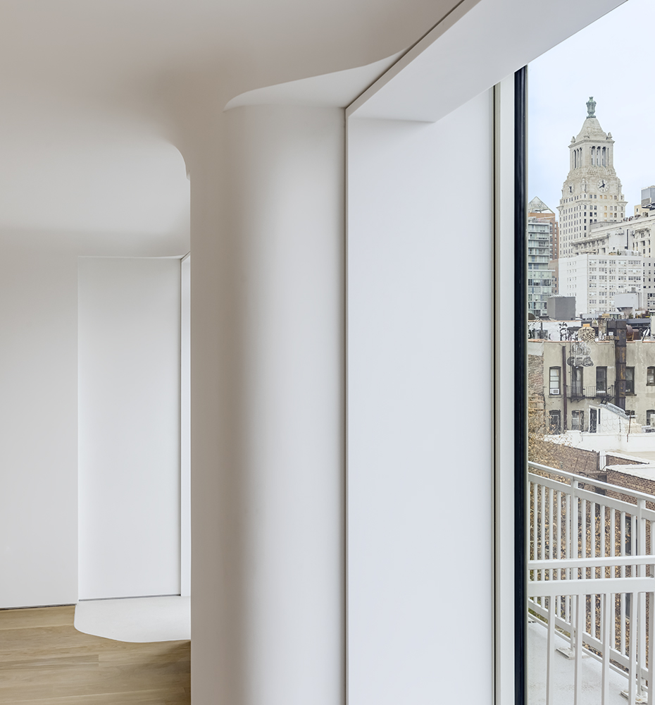
From the beginning, the owners wanted to preserve the light and ventilation that crosses north-south in the old apartment. Not only do they have beautiful city views, but coming from Europe, they loved the ability to open their windows for fresh air. The layout of the design by keeping the common spaces along this axis achieves their goal. Even the private wing was laid out in a series of bedrooms allowing air and light to flow through to the very far ends of the apartment.
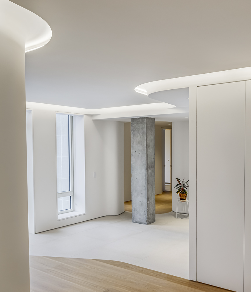
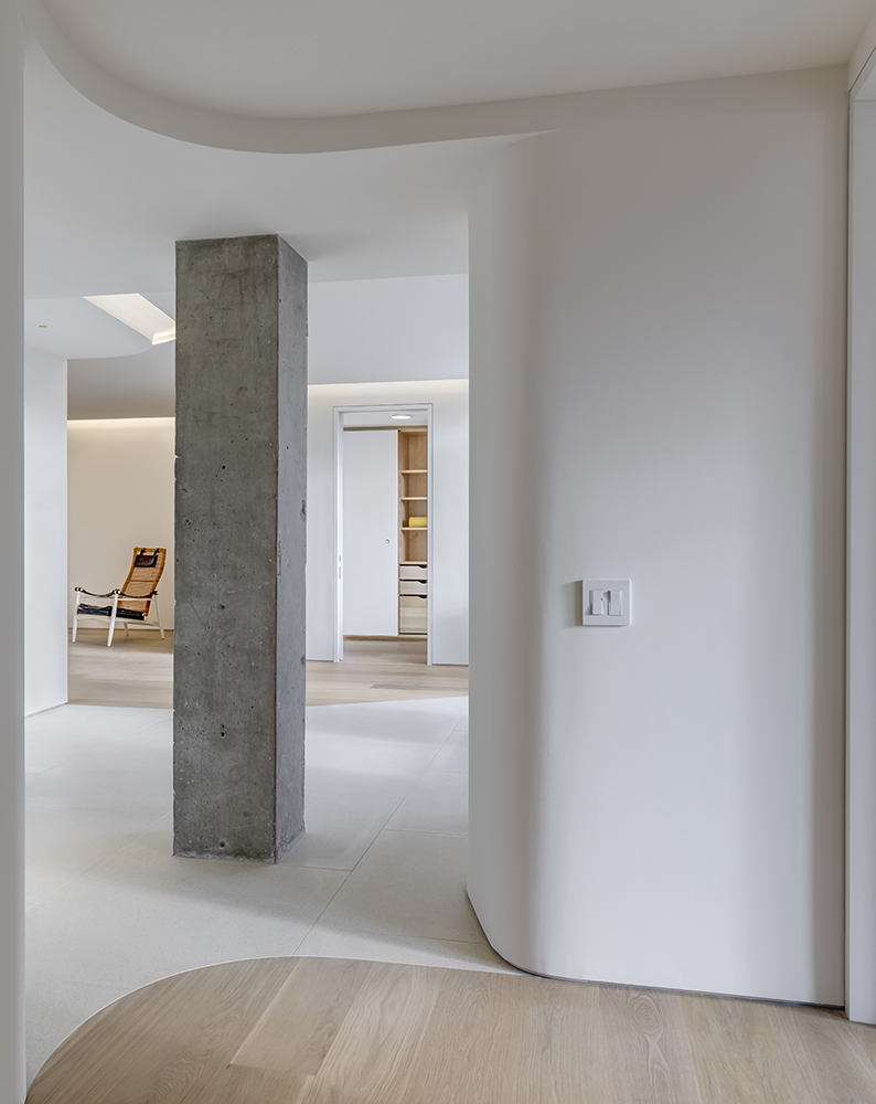
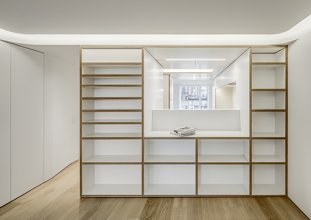
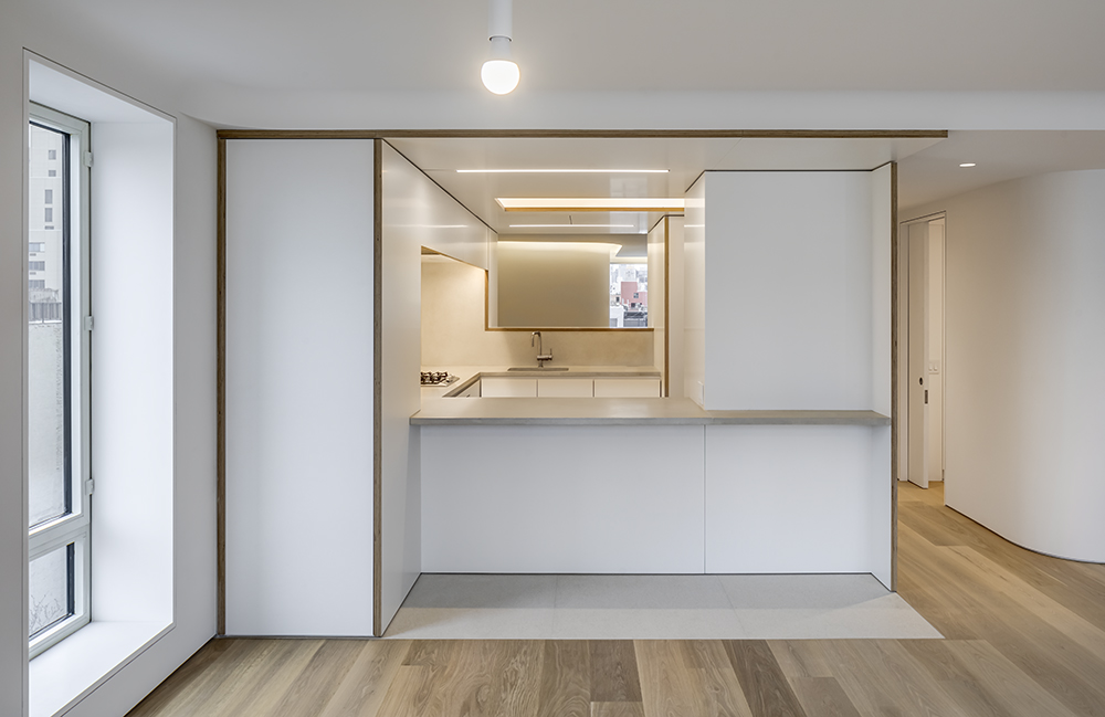
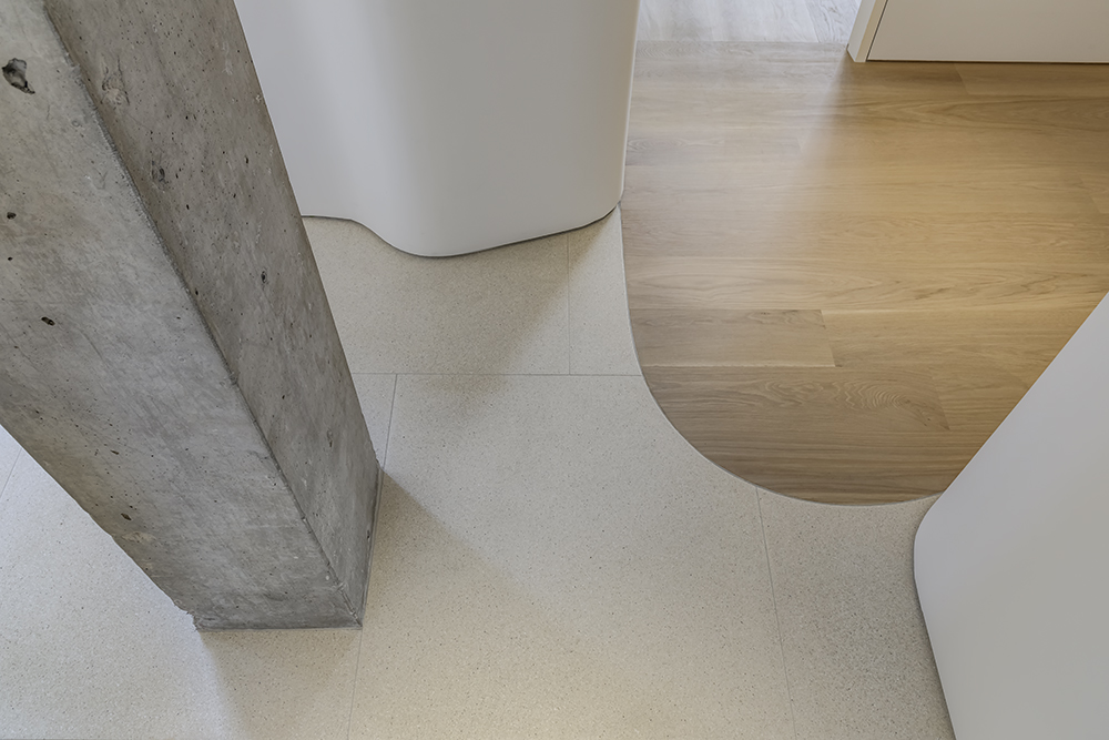
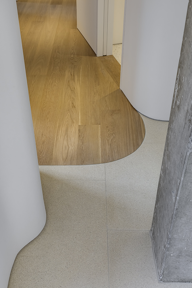
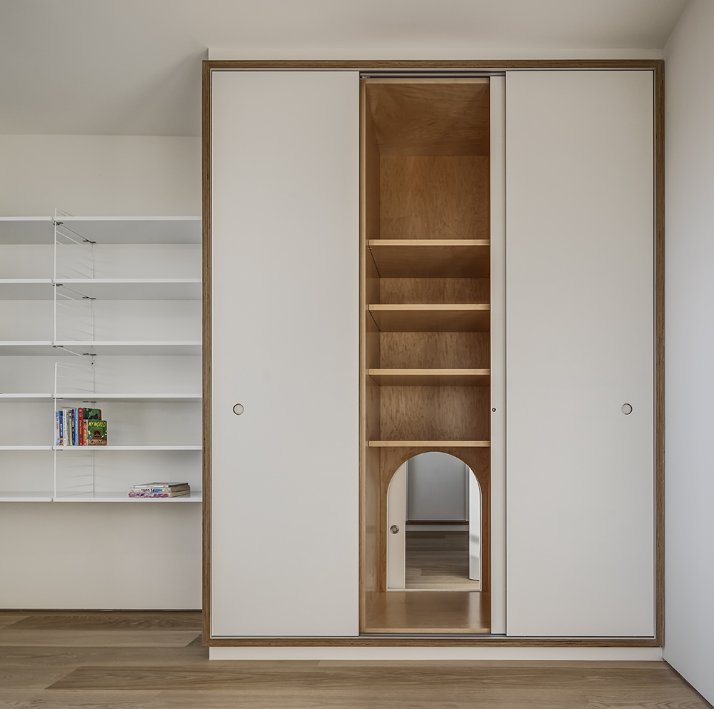
The prominent theme of curving forms, softened corners and angled walls is an abstracted representation of the “flow of air and light”, the underlying structure of the design. One’s eye is constantly moving across surfaces and materials which makes the spaces “feel” more expansive and delimited. In some areas, the curvilinear forms are casually introduced but in most cases, they obscure and hide columns and pipes. The only room which breaks from this formal order is the kitchen which the owners wanted to keep visually “contained” so as not to display clutter. We interpreted this area as a kind of “bento box” with organized containers and shelves within an orthogonal geometry.
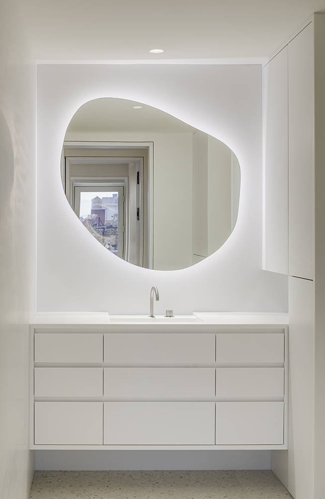
Reiterating the curvilinear forms are discrete lighting design strategies. The soft, illuminated ceiling cove at the family room helps to “float” the ceiling plane. Similar approaches are found in the kitchen ceiling cove and even the backlit bathroom mirrors which were custom cut from sketches provided by the owner’s and their children.